Sunday, 13 March 2011

letters, letters and more letters


but as you can see, Walter doesn't appear to like wearing his yellow woollen waistcoat - he is definitely NoT happy!  I spent yesterday immersed in letters, fonts and illustration as I ran my lettering workshop at The Cubby Hole, Crewe...a wonderful day!!!


We started with some loosening up exercises on a large scale, trying different pencils and crayons.


I think almost everyone fell in love with the watersoluble oil pastels that my Mum brought back from the US last year.


The lettering patterns kept us all so quite and relaxed that you could have heard a pin drop!


I love the lettering that Nigel used on this page following an activity creating different line patterns.


This is Nigel's too [he was sitting next to me so I managed to get more pics] and I just love the way the letters in the largest heart come to a point.


Little Sue counted 30 journals at home (how fab is that!) and brought some along to add writing in.  


I had anticipated this being a 'less messy than usual' workshop, but no!  Although I did have to tidy up before I could continue working on this page...


Ah, that's better!


I am repeating this workshop this coming Thursday and Saturday at Paddy's Stamping Place, Prestwich - no need to book, we'll squeeze you in!!!

Thursday, 10 March 2011

PDCC 69 Inspired by ...Dina Wakley :)


I adore Dina Wakley's free exploration of colour and texture in her journals, and have even had the honour of 'stroking' one and exclaiming over it's beauty IRL!!!  So whilst on a hunt for some great colour stories for The Play Date Cafe Challenge I stopped by her blog and Dina very kindly let me use a section of one of her journal pages as inspiration.


I had to borrow Malc's camera to take the pics last night and the colours aren't as true in these images but I hope you get the idea!  I decided to take some blue and pink wool tops and wet felt them together.


Once this was dry I laid it onto some yellowy orange fabric and some text paper.  I added stitch and also stitched on some yarn...all very therapeutic, and touchy feely :)


Over at The Play Date Cafe there is a fantastic array of inspiration from our wonderful design team
and also from our guest designer this week - Julie Day :)  We are sponsored this week by Wilson Designs so head on over to the cafe for a good mooch.

Thursday, 3 March 2011

finally got my hands on ...

... some coloured twine from The Twinery!!!  I've been admiring this beautiful 'string' on cards for a while and as Julie Ranae, our fabulous DT Co-ordinator and Senior Designer is also DT Co-ordinator over at The Twinery it will come as no surprise that they are sponsoring The Play Date Cafe Colour Challenge this week :)


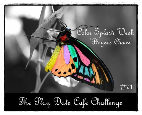
I doubt it will surprise you either that I crocheted with mine!  I wanted to see how the twisted colours would turn out :)  This gorgeous bakers' twine comes in a rainbow of different colours and as it was scheduled a 'colour splash' week Julie had the brilliant idea of players (you guys) choosing your own colour splash colour ie make a project using mainly black and white with a splash of one colour of your own choosing.


My colour splash choice was Maraschino Red :)


Don't spend too long deliberating over a colour, just choose one and go for it ;)  But if you'd like to see some gorgeous inspiration, head over to the cafe to see guest designer Julie Ranae's stunning project, and hang out with our design team here~


Thursday, 24 February 2011

PDCC70 - back on the wagon


What a fantastic response to our first 'Combined Grind' challenge last week - my piece is still half finished I'm afraid - life just pushed all blogging stuff out of the window last week.  But thankyou to those that emailed to check all was ok :)


This week's colours come courtesy of Ruby2Shoes, aren't they gorgeous?!!!  The idea for my project started with a metal flower I purchased from The Cubby Hole, Crewe on Tuesday, and some embossing powders I bought at the same time, inspired by Fran on the Woodware stand at the trade show.


This is a small black sketchbook by Daler-Rowney from Dunelm, about A5 in size.


I got my dabbers out to paint a patch of colour on the front, only realising after painting in orange, that it I meant to do it turquoise lol.


So I painted over it!


Then added some green through my flower stencil.


I cleaned my stencil off inside my journal, the start of a page :)


I kept the stencil out to add more colour to the front of the book.


After using the metal flower as a stamp, which didn't show up too well, I attached it to the front of the journal and filled it with green embossing powder.


The green is a very 'flat' colour, so after adding some orange powder to the centre of the flower, I filled the whole shape with kaleidoscope embossing powder for a bit of sparkle!


Some snippets of painted paper and lace, bling and fluffy wool with beads and I was rather pleased with the result.  I was trying to keep the design in the bottom right hand corner but my backgrounds always creep into the 'white space'!!!

This week our guest designer, Maria Gurnsey, an ippity chick of great fabulousness, is also providing our prize.  Head over to the play date cafe to see the wonderful ippity stamps she's given us to give away :)  And whilst you're there, why not check out the great inspiration provided by our wonderful team of designers.  This week there are one or two projects other than cards to give you inspiration :)


Wednesday, 23 February 2011

WOYWW - in the studio


Today I am working in my friend's art studio at The Mustard Tree in Ancoats, Manchester. [I'm usually over there on Tuesdays but I had a fabulous day out to The Cubby Hole, Crewe yesterday with a couple of friends :)  We had such a fun time :)  ]  I am gathering together shapes and patterns to use in my pieces for my exhibition, and practising working BiG!!!


It's a wonderful place to work in, full of inspiring objects, and surrounded by fun people - we have a good laugh as well as supporting each other in our work.


Graham is a really talented artist, and is currently working on commissions for John Lewis and The Hilton Hotel - if you know Manchester's Betham tower well enough you can just spot it on Graham's easel in the background.

Tuesday, 22 February 2011

more later, as promised ;)

Met two very busy people, one gave me a sample, the other didn't...guess who!!!

 [Sue, next time we see an old ledger, we MuST buy it, this one was FaBuLouS!!]


Dyan's ledger book was 'absolutely fabulous darling'!  Full of colour, images, writing, and wonderful snippets of someone's handwritten numbers.  Every time I saw Dyan the ledger was held close with both hands!


It's that first mark in such an old book that's the hardest, but this ledger would never be looked in otherwise, so a great new use for it!


Carol was very taken with Dyan's Dina Wakley style kitchen roll, used to mop up excess ink:


Then of course my yummy tag was from the Timness himself. 


I AdOrE the new distress ink stains, the colour is so easy to apply, and looks fantastic layered, and is oh so, so vibrant.  The kraft paper is a must too for lovers of kraft paper with black printing on - fab, fab, fab.


And check out my 'crinkldy' ribbon!  So easy to customise with the ink stains.  I did like the perfect pearls mists, which spray the shine without a coloured ink, but I don't use that idea enough to warrant them ... yet!


But the distressing tool has been added to my birthday list - so much better than my scissors!  There was a very cool looking little dispenser for tissue tape, which just looked too cute not to have lol!


I must also share a pic of another special person (I'd show you Wendy and Jennie and Kate and Colin too but didn't take your photo!!!) learning to knit/crochet with some fabulously therapeutic wool from the Wendy wool company:


We called it 'monkey wool' as it looked like monkey's tails, and the pieces on the wall looked like monkeys!  It's texture is like fleecy jumpers - cosy!

LinkWithin

Related Posts with Thumbnails