Sunday, 14 April 2013

a gallery crawl (no pubs involved, unfortunately ;) )


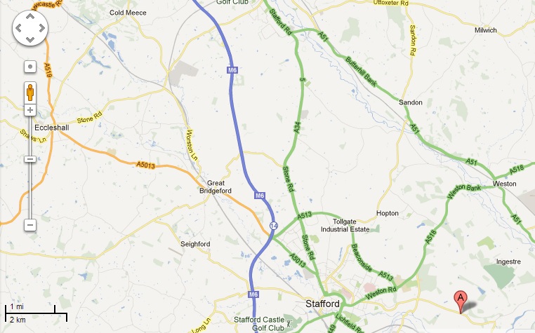
 I took my daughter (nearly sixteen) and my two nieces (nearly fifteen, and ten) on a bit of a gallery crawl the other day.  We started off at Unit Twelve Gallery near Stafford, run by the very talented Jennifer Collier.  The current exhibition is called 'Traditional Twisted' and features work by one of mine and Sophie's (Grammar?) favourite artists, Alix Swan as well as work by someone we know from our home town, Leah Fletcher.


Alix's work is based on traditional tales and I have a couple of her tiny books.  For this exhibition she had created wooden boxes containing elements from the stories, with a handle on the side to turn (which played music) and a book tucked in the back with a padded label stating 'pull me'.


 I love the way she reduces the stories to single words or snippets of sentences.


 And that long, thin book for 'Rapunzel' is just fab!  Sophie and I are already booked on her two day workshop at the end of May where we'll spend a whole weekend making a little hard back book and, I assume, putting some content in it.


 I'm struggling to decide which story, if any, to do as 'The Elves and the Shoemaker' is my very, very favourite, alongside 'The Three Billy Goats Gruff'!  But Sophie is doing 'Little Red Riding Hood' for her GCSE project and I'm loving the references to trees, the snippets of red for the girl and grey for the wolf; plus 'The Princess and the Pea' would give great castle imagery and snippets of fabric for the mattresses, and would really suit a long thin book. Hmmm.


 Other work in the exhibition included these lovely paper/cloth quilts by Maria Thomas.  Look carefully and you can see regular packaging for biscuits and cakes and other sweet goodies.


Leah Fletcher's work is a beautiful combination of vintage fabric, memories and porcelain.


From Unit Twelve Gallery we travelled West, just a few minutes down the road to Stafford where we saw the 'Mad Dogs and Englishmen' exhibition by Lauren Van Helmond at the Shire Hall Gallery (Sue, you'd love this!)


Lauren creates amazing metal sculptures of dogs and combines them with blokes!


I love how, with a simple bit of carving, wooden spoons can have such character!


The gallery shop is fabulous, full of way too many goodies.  There's a cafe too but we didn't have time for cake unfortunately!


Off on the road again we headed for the market town of Eccleshall, where a group of artists have got together and run a gallery called 'gallery at 12'.


It's a proper English town and the photo really doesn't do the main street justice, but how fab is that old fire station!


It was great to see work by Jo Hill in particular as I love her textile designs.


A quick trip to the old fashioned sweet shop completed our trip as my youngest niece had to get back to go bowling with a friend.  Cake would have been nice, but never mind, and there are lots of little boutique shops in Eccleshall which looked fabulous through the windows.

Friday, 12 April 2013

21 secrets goes pearshaped


 My good friend Chris, from Pearshaped Crafting, came over this morning to do a bit of journaling.  After a bit of umming and ahhing I'd signed up to the '21 Secrets' series of art journaling workshops and we decided to do one this morning.  To choose which one, Chris picked a random number out of her head - 10 - and we counted along to find the tenth workshop which was Kate Crane's!


Funnily enough we've taken a class with Kate together before!


Chris' page started with reds and greens.  I decided to go for browns and greens, but discovered that Mushroom Adirondack spray is nearer a grey when sprayed over gesso!


I didn't have any acrylic ink to hand so used a couple of pipettes to add inky circles with ink taken from my Adirondack spray bottles.


Chris used her Neocolour water soluble crayons to add her circles.  Much more subtle!


I had been saying that I was resisting the current journal trend of painting faces (actually, I don't have to resist hard as faces aren't really 'my thing') but looking at my 'blobs' they seemed to be crying out for facial features.  Sue's funny bird doodles came to mind, as did Dr Seuss and Carla Sonheim's imaginary creatures!!!


I intended to make a couple of the 'blobs' into flowers, but forgot - or maybe they just didn't want to be flowers!!


The blob at the base of the 'elephant' looked so like a little snail without a shell I just had to doodle him in, despite it looking a bit odd, but then, the whole page is odd!


I just added eyes to each blob and went from there!


"Be who you are"
Dr Seuss

EDIT:  Chris has blogged her page so head on over to her blog HERE to see how differently the pages turned out!

Tuesday, 9 April 2013

a journal page at The Play Date Cafe


 When I saw this week's Play Date Cafe Colours I knew I had to play along!


It was tempting to use a manilla tag as a base but I decided to challenge myself and do a journal page with the colours instead.  They are  Cappuccino...Slate...Burlap

One of the pages had a burgundy overspill from the previous page so I started by sponging a dark brown acrylic paint around the edge of the page and went from there!


My grey spray ink was a little darker than I remembered (it's an 'altered original' by Dyan Reaveley, pre-Ranger) but it all works so ...


Whilst away on holiday I discovered the 'panorama' option on my iphone and had a go using it to take the whole double page spread - it's easier to take a photo and crop it, this image is a little wonky!


Note to self - use this colour combo again :)  There's loads of gorgeous inspiration with these colours over at The Play Date Cafe if you fancy heading over there, they're a fab design team and this week are joined by the DT from the Jenni Bowlin Studio.

Sunday, 7 April 2013

Art Journal Freedom by Dina Wakley


A couple of years or so ago now I took a class at Art from the Heart with Dina Wakely.  When I make cards I love a lot of white space on them and I particularly wanted to transfer this to my journaling.  Dina's new book, 'Art Journal Freedom',  has a whole chapter on 'white space' and was a great reminder of her workshop.


It really is a fabulous book, and quite different to the other journaling books on the market, teaching about composition and colour theory - knowing the rules means you can break them if you like!


I used Dina's 'circle' page design, creating a swirl of watercolour before adding some texture to some of the lines with a pecil crayon then adding circles through a large piece of 'sequin waste'.  I stamped a couple of the flowers then drew the other two before adding the words from a Stampotique stamp.  Dina's challenge is to create a second page using the same elements but in different quantities.  I've not done that yet.  I did, however, NoT do a double page spread, which is my usual way of working!!!  Quite a breakthrough for me!  I just felt that the page was too long and thin, as a double page spread, to carry this composition.


My 'low cloud' page did work well this size though.  On the first day of our ski-ing holiday my youngest son questioned whether we could refer to 'low cloud' whilst up in the mountains as, surely, it was just that we were high up and maybe we should call it 'high people' instead!  This really tickled me so I carved a couple of stamps - one of a tree, the other with the word 'cloud' - and made a journal page.


I used Tim's umbrella man and put him at the top of the mountain because I really did meet a lady with an umbrella whilst walking at the top of 'Saulire' between two ski lifts!  It was snowing.  


I made the mountains from a piste map and added the true names and heights of a couple of the mountains I went to the top of using my pedestrian ski lift pass.


Coming 'down' is a bit scary!  But the lift attendants were all lovely, and often slowed the lift down at the end to help me get off!!


And it was definitely worth it for the views!


Saturday, 6 April 2013

What on earth was I thinking?!!!

... when I decided NoT to include my snowflake stencil in my travel journal kit for a week in the French Alps!!!


Whilst the rest of my family went ski-ing (I tried it a few years ago and it scared the living daylights out of me so I stuck to walking this time!) I had time to read, walk and journal :)


Bliss!


The view from the apartment changed daily, sometimes snowy, sometimes cloudy, sometimes very clear, but it did have an influence on my journal pages.


I made myself a couple of stencils.  One of the little tree you may be able to see peeping behind the building in the carpark in the above picture; and of a snowflake!  Funnily enough, after hankering after a snowflake image I didn't use it that much, but still...


My other influences were a couple of journaling books I bought recently to bring away with me.  I love Melanie Testa's style of journal page so treated myself to 'Dreaming from the Journal Page'


Her suggestions for 'decorative drawing' [pg 84] got me adding some drawn texture to my pages.


I took two journals with me, and worked in both (well, a couple of small ones snuck in there two but I didn't use them).  One of them is my typewriter teaching guide, which I love to use, and the second was a new one from Hobby craft - the same size as the typewriter book but plain cartridge paper inside.  Both books are A4 in size, but in landscape format, so the pages are really long when you work on a double spread.


Although I really like this page now, it took a lot of working at, and didn't feel quite as relaxing as when I splash a bit of ink or paint on a page and respond to it from there on in (although learning curves don't tend to be that relaxing!)  It's my 'Melanie Testa' style page!


I did enjoy painting with my watercolours though, something  I used to enjoy at school but hadn't really incorporated into my journals.  I really like the contrast of pencil with paint and pen and added some visual texture by tracing within my stencils - not that is ReaLLY fun!


I have more pages to share, but will keep them for another post, some inspired by my other new book, Dina Wakley's 'Art Journal Freedom' which I HiGHLY recommend.


Friday, 29 March 2013

art journaling in clay


I recently got to play with some clay at our local secondary school.  After seeing the image below on Pinterest I decided to have a go at adding texture to a clay tile:


Actually, I made a few!


On the advice of the art teacher I cut out the flower shape in card, then pressed this into the tile using a rolling pin.


I added texture with rubber stamps, the end of a skewer and by adding some tiny balls of clay.


I then got to splash on some coloured slip!  Looking forward to seeing what these pieces look like once they're fired!!!


Sunday, 10 March 2013

Sanctuary Arts Art Retreat Part One

A couple of weeks ago I went on an art retreat over in Saltburn-on-sea, organised by the fabulous Beth Sigsworth of Sanctuary Arts.  It was a fabulous weekend, full of workshops, meeting new people, and of course, the sea!


One of the workshops I took was run by Beth, who usually works with the driftwood and sea glass she finds on the beach, but for the Saturday afternoon session had chosen to offer a slightly different take on working with wood.


For aaaaaaaaaages I've had 'do transfers using magazine paper and gel medium' on my 'to do' list.  I have all the materials, and an idea of how to do it but had never got around to having a go!  We started by choosing a word (mine was 'grace') then choosing some imagery to go with it.


A song has been going round and round my head for a few weeks now, one we've been singing in church, which includes the line

which was my reason for choosing the word 'grace'.  I can't, however, explain why, when I thought of avalanches I thought of water and picked shades of blue from the magazine lol!!!  I transferred some lettering but mostly used my trusty rub on letters before coating the whole board with wax.


My next workshop was a painting one, all about responding to the paint/supplies/resources rather than worrying about what the final piece looked like.  My favourite activity was painting blindfold!!!


We worked in pairs, one person blindfolded, the other making sure the painter knew where the paint was and the paper!  We were painting the jar of flowers in the centre of the table.  It was amazing how interesting the paintings turned out


One lady didn't have a partner so Keith (the tutor, above) guided her whilst she was blindfolded, then when it would have been his turn to work blindfold, asked her to paint the jar with her eyes open.  I wish I'd taken a photo because the blindfold version was so much more lively and interesting.

I need to take some photos of the other work I produced over the weekend to share the rest of the time with you but hope this gave you a bit of a taster.  I'd forgotten I'd not blogged about it, and remembered when I saw Dyan Reaveley's list of workshops at Art from the Heart where 'faith journaling' was one listed.  This sounds fab, and Bernice and Caroline both went to the first workshop and had a great time!  Click on their names to read their accounts.  I'm gutted I can't make either of the next workshops, ah well!

LinkWithin

Related Posts with Thumbnails